tableタグで作った表組をスマホに対応させた、html+cssのサンプルコードになります。
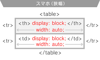
ブラウザの幅が480pxより狭くなると、<th><td> が縦並びになる設定です。
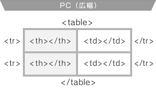
以下のような、tableタグで組んだhtmlに対して、cssを設定していきます。
<table>
<tr><th> 項目1 </th><td> 項目1の内容 </td></tr>
<tr><th> 項目2 </th><td> 項目2の内容 </td></tr>
</table>
デモ
| 項目1 | 項目1の内容 |
|---|---|
| 項目2 | 項目2の内容 |
CSS+html
<!-- CSS -->
<style type="text/css">
<!--
.tbl01 {width: 94%;margin: 0 auto;border-collapse: collapse;
-moz-box-sizing: border-box; -webkit-box-sizing: border-box; box-sizing: border-box;}
.tbl01 th,.tbl01 td {padding: .6rem 3%;border: 1px solid #ccc;
vertical-align: top;text-align: left;}
.tbl01 th {background: #fafafa;}

@media only screen and (max-width:480px) {
.tbl01 th,.tbl01 td {display: block;width: auto;border-bottom: none;}
.tbl01 tr:last-child {border-bottom: 1px solid #ccc;}
}
-->
</style>
<!-- html -->
<table class="tbl01">
<tr><th>項目1</th><td>項目1の内容</td></tr>
<tr><th>項目2</th><td>項目2の内容</td></tr>
</table>
@media only screen and (max-width:480px) のメディアクエリで、
ブラウザーの幅が480px幅以下になった時を指定します。
display: block;width: auto;で、 <th><td> を幅いっぱいに表示して縦に並べるようにしています。
また、
box-sizing: border-box;は、paddingとborderを幅(や高さ)に含める指定です。
border-collapse: collapse;は、borderを重ねて表示します。